


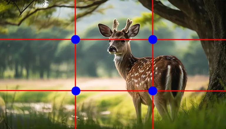
If you are looking for rule of thirds examples to sharpen your design or photography skills, you are in the right place. This technique, which divides an image or layout into a 3×3 grid, helps you position key elements where the human eye naturally falls. By placing essential subjects off-center, you create a more dynamic visual conversation, ensuring that your audience’s gaze travels smoothly across your composition. Below, you will discover the basics of this principle and see how professionals apply it in creative ways.
Embrace the rule of thirds.
Before diving into specific examples, take a moment to understand why the rule of thirds is so popular. It hinges on the asymmetry created by using three columns and three rows, rather than a perfectly balanced four-column layout. This asymmetry is more in tune with the way people instinctively scan images. Studies show that centering every element can sometimes make a layout feel dull, but aligning features with the grid’s intersections adds harmony and flow.
Guidelines such as the rule of thirds are widely used across different fields. Photographers frequently rely on these grid lines to arrange horizons or main subjects, while graphic designers position crucial calls to action near the same points to maximize user interaction. Suppose you want a deeper overview of how this principle fits into broader design strategies. In that case, you can explore our resource on the rule of thirds in graphic design or learn more about building visual hierarchy in web design.
Explore creative examples
Below are six inspiring examples of the rule of thirds that illustrate how you can harness this concept in different media. Each scenario utilizes the grid in a way that draws attention, sparks curiosity, and encourages viewers to explore further.
1STAAK web design layout
STAAK, a London-based design studio, demonstrates the power of the rule of thirds on its homepage. Their headline text aligns with an upper horizontal line, while supporting content is placed near a left vertical line. This intentional positioning guides users’ eyes from the bold header to the subtler, descriptive text. The space on the right side balances the overall design, offering a clear path for the viewer to follow.
2Activewear advertisement
In this striking ad, the photographer places the running subject near the left vertical grid line, creating purposeful negative space on the right that allows the athlete’s movement to feel dynamic and ongoing. By avoiding a center placement, the designer conjures a sense of momentum. This idea applies beautifully to product marketing—when you want to emphasize action or motion, consider shifting your subject to one of those third lines.
3Cinematic framing in The Avengers
Action movies frequently employ the rule of thirds to ensure the audience’s eyes track the action without missing essential details. In The Avengers, for instance, a hero is often placed at a left intersection, while a looming threat occupies the top-right portion of the frame. This visually compelling approach not only highlights the characters but also builds tension by splitting the focus between conflicting elements. If you want to explore similar photographic applications, check out our resource on the rule of thirds photography.
4Social media post styling
Social platforms like Instagram favor bold visuals, and using the rule of thirds helps your content stand out in busy feeds. For example, consider placing your subject—such as a product shot—on a prime intersection and allowing ample negative space for text or graphic elements. It is a subtle way to direct attention to the product while still maintaining an uncluttered look.
5UX design for navigation
🎓 Want to Master This Skill?
Join 10,000+ students at VFX India — Industry-standard training in Chennai with 100% placement.
🚀 Enroll Now💬 WhatsAppUI and UX designers often position key interactive elements near the grid’s intersection points to increase discoverability. Placing a call-to-action button or main menu in one of these hotspots ensures that visitors intuitively notice them. Incorporating the rule of thirds in your digital interfaces can boost user engagement and streamline site navigation.
6Minimalistic product photography
If you prefer simplicity, the rule of thirds can add just the right amount of balance without overwhelming the frame. By aligning a product—anything from a succulent to a new gadget—along a vertical or horizontal line, you highlight the subject while leaving clean negative space. This technique draws instant attention to the item, resulting in a confident and uncluttered look.
When experimenting with these approaches, remember that the rule of thirds is a guideline, not an unbreakable law. Some of the best compositions break away from this principle to create surprising or symmetrical designs. However, for most beginners looking to establish solid fundamentals, practicing with the 3×3 grid is an excellent starting point. For more information on setting up an effective grid, see our guide on the rule of thirds grid.
Mastering the rule of thirds provides a reliable way to design layouts that directly guide the viewer’s eye exactly where you intend. Whether you are crafting a social media post or a movie poster, this principle adds visual structure and keeps your compositions engaging. Try it out, experiment, and see how you can adapt it to fit your style.
FAQS – Frequently Asked Questions
It helps you create balanced, engaging, and dynamic compositions by positioning key elements off-center where the viewer’s eye is more likely to focus.
Not necessarily. While intersections are powerful focal points, aligning subjects along one of the grid lines can still create a visually appealing layout.
Absolutely. Aligning text boxes or headlines on the grid can guide readers’ attention and enhance readability across your designs.
You can sketch or mentally visualize the grid by dividing the layout into three equal parts horizontally and vertically, or use editing software afterward to fine-tune.
Yes. Even in abstract or minimalistic designs, the rule of thirds helps suggest a natural flow by retaining balance between positive and negative space.
Break it intentionally. For instance, center a subject when you want to emphasize symmetry, or place it in a corner if tension and drama suit your concept.
Photography, UX design, web design, print layouts, and video all leverage the rule of thirds to catch and keep the viewer’s attention.
It improves the odds, but it is no guarantee. Treat it as a strong starting point. Professional designers often blend this rule with other techniques, such as color theory or typography.
Take photos, design quick layouts in apps like Canva, or mock up user interfaces. Consistent practice will build the “muscle memory” to apply it seamlessly.
Yes. Even experts use the rule of thirds as a reminder to balance their compositions. They may break it intentionally when they want to emphasize different creative directions.
Yes. Even experts use the rule of thirds as a reminder to balance their compositions. They may break it intentionally when they want to emphasize different creative directions.
You can find rule of thirds examples all around you, like how a photographer places the horizon in the top third of a landscape, or how a subject is framed off-center in a portrait to create balance and movement.
Sure! Classic rule of thirds examples in photography include placing a person’s eyes along the top third line in a portrait, or aligning a tree or building along the left or right vertical gridline in a landscape shot.
In graphic design, rule of thirds examples include placing a call-to-action button in a bottom-third hotspot or arranging text and visuals in a way that leads the viewer’s eye naturally across the layout grid.
Absolutely. Directors often use rule of thirds examples to frame characters off-center in a shot, drawing attention to the scene’s background or emotion while maintaining visual interest and storytelling depth.
The rule of thirds works because it avoids dead-center symmetry, which can feel flat. Instead, they guide the viewer’s eye, create tension and space, and give compositions a more natural, dynamic feel.
Yes! On platforms like Instagram, rule of thirds examples include placing the subject in one-third of the frame and leaving open space for captions or backgrounds, making the image feel more professional and engaging.
Rule of thirds examples are simple, visual guidelines that help beginners instantly improve composition, whether they’re shooting with a phone, designing in Canva, or editing a reel.
Try using the rule of thirds grid in your camera app or design software. You can practice by framing a cup of coffee to the left third or placing a title banner across the top third in a presentation slide.
Yes, even with new trends in minimalist or gridless layouts, rule of thirds examples remain a timeless starting point for building balanced, eye-catching visuals across media.
📑 Table of Contents
Master VFX, Design & AI in Chennai
Industry-standard training with 100% job placement. Start your creative career today!
🚀 Enroll Now💬 WhatsApp Us📂 Categories
Graphic Design (49)VFX (21)Action CGI (11)Visual Effects (10)Live Action (9)Typography (9)chroma key (6)Green Screen Keying (6)Stereoscopic 3D (5)Digital Marketing (5)Visual Effects (5)SEO (5)Camera Tracking (4)3D Movie (3)AI Graphic Design (2)app Development (2)UI UX (2)Match moving (1)Web Development (1)Film Editing (1)🎯 Related Courses
📚Graphic Design Course in Chennai📚VFX Course in Chennai📚Video Editing Course in Chennai📰 Recent Posts