


Are you looking to elevate your photography with the rule of thirds? By breaking your frame into nine equal sections, you position elements along four key intersection points, creating a visual conversation that resonates with the way our eyes naturally move. This guideline plays a pivotal role in capturing balanced compositions for print, web, and social media. Below, you will find a comprehensive guide that shows you how to harness this principle to improve everything from portraits to web layouts.
Explore the core principle.
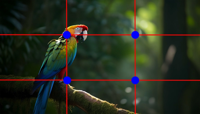
The rule of thirds is all about dividing your image into three rows and three columns, resulting in four power points where the grid lines intersect. Placing vital elements on or near these points heightens visual appeal and keeps viewers engaged. You will see this technique applied across various media, from photography to advertising, because it complements the areas where the human eye naturally tends to focus.
Furthermore, many designers rely on the rule of thirds in graphic pieces to align text, icons, and other features. If you are interested in a deeper breakdown of design-based examples, consider checking out our rule of thirds in graphic design resource.
Set up your grid
Creating a rule of thirds grid is straightforward in most photography or design applications. You can enable grid overlays in tools like Photoshop, Illustrator, or even smartphone camera apps. The process is pretty simple:
- Activate the grid or overlay option in your preferred tool.
- Ensure two vertical and two horizontal lines appear, dividing your frame into nine equal sections.
- Align your central subject on one or more of the four intersection points for a balanced layout.
When designing for print or web content, measurement tools help you divide your canvas properly—set your guides at 1/3 and 2/3 of your image’s width and height.
Position your key elements.
Think of each quadrant in the grid as an opportunity to lead your viewer’s gaze. Whether you are capturing a portrait subject’s eyes or positioning a product in a digital ad, try to place it around these grid lines and intersections. This method naturally creates asymmetry that adds energy to your compositions. To see how professionals apply it, our curated rule of thirds examples break down real-life shots and design layouts that utilize this approach successfully.
When composing landscapes, for instance, many photographers recommend aligning the horizon line along the top or bottom horizontal axis rather than centering it. Similarly, in product photography, you might position the product on a vertical grid line to allow surrounding details to breathe, thereby enhancing the sense of depth.
Combine with visual hierarchy.
Pairing the rule of thirds with a well-structured hierarchy ensures readers or viewers focus on the most essential content first. When planning your layout for websites or social platforms, incorporate consistent font sizes, color contrasts, and strategic white space to guide your users effectively. To see how it all works together on the web, explore visual hierarchy in web design and learn how strategic placement of headlines and images can significantly improve user engagement.
Consider breaking the rule.
With that being said, the rule of thirds is a guideline, not an unbreakable law. Some compositions benefit from centering the subject or using symmetrical framing. If you already have a balanced scene or you are looking for a particular effect, feel free to deviate from the grid. Embracing these moments of creative exploration often leads to innovative designs and unique photographs.
Use software for adjustments.
Sometimes, you capture a spontaneous photo that doesn’t adhere to the rule of thirds. Luckily, post-processing tools such as Lightroom or Photoshop allow you to crop and reposition your subject closer to those intersection points. This refinement can turn an average shot into a more dynamic image that holds viewers’ attention.
If you are not using a dedicated photo editor, many free or affordable programs also feature cropping guides to help you perfect your composition. You can even experiment with re-cropping older snapshots to discover new perspectives and better placements.
Remember, the rule of thirds aims to create a comfortable flow for your audience, leading them through a visual conversation. While this method is tried and tested, do not be afraid to adapt or break it in pursuit of creativity. Through experimentation, you will discover how this foundational technique can help you craft stunning, user-focused visuals consistently.
FAQS – Frequently Asked Questions
They are both layout aides. A grid usually refers to the lines built into your camera app or editing software, while guides are custom lines you place to measure or align elements.
Absolutely. Many videographers align subjects and other focal points according to the rule of thirds, giving the final footage a more cinematic look.
No, centering works well for symmetrical compositions or to create creative effects. The rule of thirds is generally a best practice for dynamic, natural-looking layouts, but it is not mandatory.
Yes. Whether you are creating Instagram posts or YouTube thumbnails, positioning your subject along a grid intersection point helps you draw attention quickly.
You can split your digital canvas into three rows and columns. Then, align key elements such as images, buttons, or headlines on intersection points to make navigation smoother and more intuitive.
Not necessarily. Most smartphones, basic editing apps, and even online platforms have the option to overlay or set up a simple rule of thirds grid. You do not need expensive software to use this principle effectively.
They are where the horizontal and vertical lines intersect in the rule of thirds grid. Placing focal points here often yields a more compelling composition.
Guiding your placement of text and images helps highlight what is most important first. This natural progression complements a structured design, allowing users to find critical information without distraction.
Shifting the horizon to either the top or bottom third typically gives more emphasis to your sky or foreground, creating a more engaging landscape image.
It is a great starting point. Once you master it, you will gain more confidence in framing shots or designs. From there, you can experiment with other composition guidelines to develop your own style.
Rule of Thirds Photography is a technique where the image frame is divided into nine equal parts using two horizontal and two vertical lines. By positioning key elements along these lines or their intersections, Rule of Thirds Photography helps create a well-balanced, professional-looking composition that naturally draws the viewer’s attention.
For beginners, Rule of Thirds Photography is an easy yet effective way to improve image composition without needing advanced equipment. It teaches visual balance and focus, making even simple photos look more engaging. Practicing Rule of Thirds Photography builds a strong foundation for mastering more complex techniques later
Yes, Rule of Thirds Photography applies to various genres, including landscape, portrait, wildlife, and street photography. It enhances visual structure and storytelling across most photo types. However, experienced photographers sometimes break away from Rule of Thirds Photography to explore creative or symmetrical compositions.
Most modern smartphones and cameras have a built-in grid option that supports Rule of Thirds Photography. Simply enable the 3x3 grid in settings and align your subject with the lines or intersection points. This makes Rule of Thirds Photography accessible and easy to practice, even for casual photographers.
While Rule of Thirds Photography offers reliable visual structure, breaking it can lead to more impactful or dramatic shots. Centered subjects, symmetry, or abstract compositions often require deviation from the rule. Understanding Rule of Thirds Photography gives you the confidence to break it purposefully for artistic expression.
Master VFX, Design & AI in Chennai
Industry-standard training with 100% job placement. Start your creative career today!
🚀 Enroll Now💬 WhatsApp Us📂 Categories
Graphic Design (49)VFX (21)Action CGI (11)Visual Effects (10)Live Action (9)Typography (9)chroma key (6)Green Screen Keying (6)Stereoscopic 3D (5)Digital Marketing (5)Visual Effects (5)SEO (5)Camera Tracking (4)3D Movie (3)AI Graphic Design (2)app Development (2)UI UX (2)Match moving (1)Web Development (1)Film Editing (1)🎯 Related Courses
📚Photography Course in Chennai📰 Recent Posts