


📑 Table of Contents
- 1. Why Typography Matters
- 2. Common Typography Slip-ups
- 3. Using Too Many Fonts
- 4. Improper Font Pairing
- 5. Lack of Hierarchical Structure
- 5a How to Fix:
- 6. Poor Line Spacing and Kerning
- 6a Common Issues:
- 6b How to Fix:
- 7. Keeping Alignment on Point
- 8. Consistency is Key with Fonts
- 9. Issues with Color Contrast
- 10. Lack of Attention to Color Accessibility
- 11. Simplifying Font Choices
- 12. Prioritizing Readability
- 13. Ensuring Consistency Across Designs
Typography Basics
Typography is often the unsung hero of design, working quietly behind the scenes to make your visuals stand out. Knowing how to use typography effectively can transform your design from mediocre to exceptional.
1Why Typography Matters
Typography isn’t just about choosing a font and placing it on a website; it’s also about creating a cohesive visual experience. It is the art of making text not only readable but also readable. Here’s why it’s important:
- Legibility and readability: Good typography ensures that words are easy to read and do not strain the eyes.
- Visual Order: It guides your eyes around the design like a friendly tour guide, helping to create a more seamless flow.
- Branding: Typography gives a company its unique identity, much like Coca-Cola has its signature style.
- Aesthetic Appeal: It makes designs visually appealing, keeping people engaged and interested.
Want to dive deeper? Check out our article on typography basics for graphic designers.
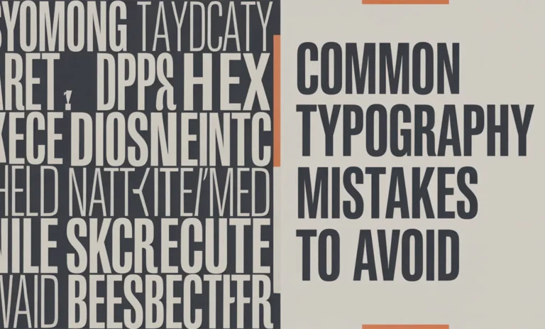
2Common Typography Slip-ups
Messing up typography can make your work appear cluttered and confusing. Here are some common mistakes to watch out for:
- Too Many Fonts: Using more fonts than necessary can lead to visual chaos. Keep it simple by limiting the number of fonts you use.
- Bad Font Match: Choose fonts that complement each other, like peas and carrots, rather than fonts that clash, like oil and water.
- Missing Hierarchy: It should be clear which elements are most important. Use different font sizes and styles to establish a hierarchy in your text.
- Spacing Issues: Poor line spacing and kerning can make your text look jumbled. Proper spacing is essential for a neat appearance.
- Alignment Problems: Misalignment is akin to hanging crooked pictures on the wall. Ensure everything is aligned correctly for a tidy look.
- Color Considerations: Insufficient contrast can make text difficult to read, especially for individuals who require clear visuals. Use eye-friendly colors to help your readers.
Avoid these errors to enhance your design skills. For more insightful tips, check out our guide on advanced typography for UI/UX. By refining these fundamentals, you can create more striking and effective designs. Continue to improve your typography skills to elevate your work. Interested in typography’s broader impact? Read more about its influence in our article on typography and social impact.
Typeface Selection
Choosing the right typeface isn’t merely a design choice; it significantly influences how people perceive and comprehend a project. However, it’s easy to make mistakes.
3Using Too Many Fonts
One common typographical mistake to Avoid is using too many fonts in a single design. Combining several typefaces can create a chaotic and disjointed appearance. To maintain a cohesive look, it’s best to stick to one or two fonts, at most three. This approach ensures your design remains clear and polished. Consistency in typefaces is especially important for branding, as it helps create a strong and recognizable identity.
| Number of Fonts | Impact on Design |
|---|---|
| 1-2 | Clean, Smooth |
| 3-4 | Okay-ish, Slightly Messy |
| 5+ | Yikes, All Over the Place |
4Improper Font Pairing
Mixing fonts that don’t complement each other is a common mistake in typography. Poor font pairings can make a design look unpolished and confuse viewers. To achieve a clean and cohesive appearance, choose fonts that harmonize well in terms of style, weight, and size.
When selecting fonts, consider using a distinctive typeface for titles and a more subtle one for the body text. This approach ensures readability and creates a smooth flow throughout the design. If you’re interested in more advanced techniques, check out our article on advanced typography for UI/UX.
| Font Type | Good Match |
|---|---|
| Serif Titles | Sans-serif Text |
| Fancy Script | Simple Sans-serif Text |
| Bold Headers | Light, Simple Text |
Keeping the font game simple and making bright pairings can make your designs look top-notch. To get more tips, check out Typography Basics for Graphic Designers and Typography Inspiration 2025.
Hierarchy and Readability
When it comes to typography, it’s not just about picking fancy fonts; you’re on a shopping spree. Establishing a clear hierarchy and keeping things readable is where the magic happens. But beware, my friend, two significant mistakes loom large: a lack of a clear layout and terrible line spacing that will leave your text looking like a poorly composed collage.
5Lack of Hierarchical Structure
🎓 Want to Master This Skill?
Join 10,000+ students at VFX India — Industry-standard training in Chennai with 100% placement.
🚀 Enroll Now💬 WhatsAppA well-structured hierarchy in typography serves as a friendly map for your readers. In a chaotic environment, people can easily become lost amidst the confusion. Here’s where many individuals often stumble:
- All Font Sizes Shouldn’t Be Equal: What is the ideal size for headings compared to regular text? Using the same size for everything is like wearing the same outfit every day. Adding variety enhances clarity and visual appeal.
- One Style Doesn’t Fit All: Using the same weight and style for all text leads to a monotonous experience. No one wants to encounter a visual flatline while reading.
How to Fix:
- Mix-Up Font Sizes: Vary the font sizes of your text and guide readers through your content.
Text Piece Good Font Size (px) Headings 24 – 32 Subheadings 18 – 22 Body Text 12 – 16 - Play with Weights and Styles: Use bold for a headline that shouts, italics for a gentle nudge. and underline sparingly to make your point stick.
Want more on styling with hierarchy? Check out our primer on typography basics for graphic designers.
6Poor Line Spacing and Kerning
Line spacing should ease the reader’s way through the text, not cause them to strain their eyes. And kerning, the space between characters, keeps the text from looking like boxed letters in a ransom note.
Common Issues:
- Squished Lines: When lines crowd together, they won’t glide effortlessly from one to the next. Ouch, eyes strained.
- Wide Character Gaps: Too much space between letters can make text look like a poorly cut ransom note—completely disconnected.
How to Fix:
- Space Out Lines: Give them some breathing room. Aim for a line spacing of around 120% to 150% of your font size for maximum comfort.
Font Size (px) Good Line Spacing (px) 12 14.4 – 18 16 19.2 – 24 20 24 – 30 - Tweak that Kerning: Adjust it to keep things tight and tidy. Nail it in display texts and headlines for extra polish.
For more neat tricks, dive into our piece on advanced typography for UI UX.
Avoiding these common blunders will keep your designs clear and your readers less cranky. Are you hungry for more? Sink your teeth into our guide on Typography Inspiration 2025, which is loaded with fresh ideas and top tips.
Alignment and Consistency
7Keeping Alignment on Point
One big no-no in typography is misaligning text. When your text isn’t in sync, it can throw the whole design off, making it look unprofessional. Maintaining good alignment ensures everything remains readable and visually appealing.
Designers often encounter roadblocks when trying to maintain consistent alignment. It’s essential to choose one alignment style (such as left, right, or center) and adhere to it consistently. Throwing different alignments all over the place jumbles up the look and can confuse readers.
| Alignment Type | Description | Example Use Case |
|---|---|---|
| Left Alignment | Text hugs the left edge with a jagged look on the right. | Found in books and essays. |
| Right Alignment | Text hugs the right edge with a jagged left side. | Handy for captions and notes. |
| Center Alignment | Text hangs out in the middle with unevenness on both sides. | Great for headlines and invites. |
| Justified Alignment | Evens out text for neat edges on both sides. | Seen in newspapers and magazines. |
Want more tips? Designers should check out typography basics for graphic designers for more insights.
8Consistency is Key with Fonts
Using a variety of font styles can make your design appear messy and chaotic. Keeping your fonts consistent makes everything hang together nicely.
When picking your fonts, here are some things to chew on:
- Font Weight: Stick to just a few weights, such as regular, bold, and italic. Mixing them up too much can mess with the look.
- Font Size: Maintain a clear hierarchy for headings and the main title to ensure readability.
- Reading: Keep those letters evenly spaced for a tidy look. Adjust it as needed to ensure a smooth flow.
| Font Style Aspect | Consistency Tip | Example Use Case |
|---|---|---|
| Font Weight | Stick with a small set (e.g., Regular, Bold) | Headlines and Main Text |
| Font Size | Keep size hierarchy clear (e.g., H1, H2, Body) | HeadlinesReadabilitydings |
| Letter Spacing | Tweak kerning to boosReadabilityty | LoReadabilitynage |
Designers seeking top-notch font consistency can explore advanced typography for UI/UX to incorporate more sophisticated techniques.
Keeping alignment and font styles in check are must-dos for creating classy and sharp typographic designs. Sidestepping these common blunders can boost the impact of your design creations. Ready to get inspired by fresh typography trends? Check out Typography Inspiration 2025 for a look into the future!
Color and Contrast
Using colors and contrast effectively in typography can significantly impact the appearance and perception of your design. On the other hand, getting it wrong can lead to a list of common mistakes.
9Issues with Color Contrast
Getting contrast right is crucial to ensuring your text is legible. If it’s not there, people might struggle, especially those with vision issues. A common blunder in this area is selecting colors that are too similar in shade or brightness.
| Example | Background Color | Text Color | Contrast Ratio |
|---|---|---|---|
| Looks Great | #FFFFFF | #000000 | 21:1 |
| Not So Great | #F0F0F0 | #FFFFFF | 1.1:1 |
| Just Right | #000000 | #FFCC00 | 13:1 |
Using contrast-checking tools can help. For regular text, aim for a contrast level of at least 4.5:1. For bigger text, aim for 3:1. For more tips on typography, check out our article on typography basics for graphic designers.
10Lack of Attention to Color Accessibility
Colors should work for everyone. Ignoring this can deter people, especially those with visual impairments, who may struggle to see specific colors.
To amp up accessibility:
- Use contrasting colors for text and background.
- Steer clear of tricky color combos like red-green or blue-purple.
- Mix in patterns and textures for clarity.
- Keep testing designs with accessibility tools.
| Color Blindness | Bad Color Mixes | Better Choices |
|---|---|---|
| Deuteranopia (Red-Green) | Red-Green | Opt for Blue-Green |
| Protanopia (Red-Weak) | Red-Brown | Swap with Blue-Orange |
| Tritanopia (Blue-Yellow) | Blue-Yellow | Go with Red-Magenta |
To meet color accessibility standards, designers should utilize the guidelines and tools available online. For more information on how typography and accessibility work together, see our guide to advanced typography for UI/UX.
Taking these steps can help avoid typography traps related to color and contrast, resulting in more welcoming and impactful designs.
Tips for Improving Typography
Getting the best out of typography involves paying close attention to some guiding principles and dodging common pitfalls. This section offers hands-on tips to elevate your typography skills without breaking a sweat.
11Simplifying Font Choices
Imagine a design trying to wear too many hats—it can get messy! Sticking with just a couple of fonts keeps things looking tidy and clear. Stick to using two, maybe three typefaces: one for headings, another for the main text, and possibly a third for a bit of flair or emphasis. Here’s
Here’s a quick guide to font usage:
| Number of Fonts | Usage |
|---|---|
| 1 | Clean and simple |
| 2 | Neat combination of headlines and text |
| 3 | Adds a dash of emphasis |
For a deeper dive into selecting the right fonts, consider our article on font selection for branding.
12Prioritizing Readability
Clear text is key to ensuring your message resonates. If you can’t comfortably read it, the whole point is lost. Factors such as line spacing, font size, and readability all play a significant role in the overall readability.
Keep these pointers in mind for maximum readability:
- Space outlines: Readability 22 times the font size for smoother reading.
- Make sure your body text is no smaller than 16px.
- Use high color contrast between the text and its background for easy reading.
Find how to juggle readability and killer design in our piece on advanced typography for UI/UX.
13Ensuring Consistency Across Designs
When it comes to typography, keeping it consistent is like wearing matching socks—a must for looking put-together. Mixing fonts, sizes, and styles haphazardly can make your work appear somewhat disorganized.
To keep things on track:
- Develop a style guide that lists your font choices, sizes, and typographic best practices.
- Use a grid system to ensure everything aligns neatly.
- Make it a habit to check that your design follows what you’ve set.
There are some helpful tools to assist you in adhering to typography guidelines. Check out our article on typography tools in Photoshop and Illustrator for more information.
By bringing these tricks into the mix, your typography skills are bound to shine whether you’re a seasoned vet or a new kid on the block. For those feeling inspired, you can explore our collection at Typography Inspiration 2025.
FAQS – Frequently Asked Questions
Common typography mistakes include using too many fonts, poor kerning, inconsistent spacing, foul line length, and choosing unreadable typefaces. Avoiding these helps maintain clarity and visual harmony.
Avoiding typography mistakes ensures your message is readable, professional, and visually appealing. Good typography enhances user experience and strengthens brand identity.
Stick to a font hierarchy, limit font choices, maintain proper alignment, and use readable type sizes. Practice and review professional designs to refine your typography skills.
Poor typography can confuse readers, weaken brand recognition, and reduce user trust. Avoiding typography mistakes ensures consistency and effective communication.
Avoid small font sizes, low contrast text, non-responsive type layouts, and improper font pairing. These mistakes hurt UX and SEO performance on websites.
Using too many fonts in a single design creates visual clutter and a lack of cohesion. Limit to 2–3 fonts to maintain consistency and professionalism.
Yes. Inconsistent line spacing, poor kerning, and misaligned text can disrupt readability and layout balance. Always check alignment and spacing in every design.
Tools like Adobe Fonts, Figma, and Canva provide font previews and spacing tools. Grammarly and accessibility checkers can also help identify readability issues.
Absolutely. Typography mistakes, such as small text, tight spacing, and non-responsive fonts, make content difficult to read on mobile devices. Use scalable fonts and test across devices.
Conduct font audits, get feedback, and follow design principles like contrast, hierarchy, and alignment. Reworking typography with these in mind can drastically improve quality.
📑 Table of Contents
- 1. Why Typography Matters
- 2. Common Typography Slip-ups
- 3. Using Too Many Fonts
- 4. Improper Font Pairing
- 5. Lack of Hierarchical Structure
- 5a How to Fix:
- 6. Poor Line Spacing and Kerning
- 6a Common Issues:
- 6b How to Fix:
- 7. Keeping Alignment on Point
- 8. Consistency is Key with Fonts
- 9. Issues with Color Contrast
- 10. Lack of Attention to Color Accessibility
- 11. Simplifying Font Choices
- 12. Prioritizing Readability
- 13. Ensuring Consistency Across Designs
Master VFX, Design & AI in Chennai
Industry-standard training with 100% job placement. Start your creative career today!
🚀 Enroll Now💬 WhatsApp Us📂 Categories
Graphic Design (49)VFX (21)Action CGI (11)Visual Effects (10)Live Action (9)Typography (9)chroma key (6)Green Screen Keying (6)Stereoscopic 3D (5)Digital Marketing (5)Visual Effects (5)SEO (5)Camera Tracking (4)3D Movie (3)AI Graphic Design (2)app Development (2)UI UX (2)Match moving (1)Web Development (1)Film Editing (1)🎯 Related Courses
📚Graphic Design Course in Chennai📚VFX Course in Chennai📚Video Editing Course in Chennai📰 Recent Posts


