


📑 Table of Contents
- 1. Importance of Typography in UI/UX Design
- 2. Enhancing User Experience with Advanced Typography
- 3. Understanding Typography Hierarchy
- 4. Utilizing Font Pairing Techniques
- 5. Implementing White Space Effectively
- 6. Customizing Typography Styles
- 7. Incorporating Variable Fonts
- 8. Creating Dynamic Text Effects
- 9. Designing for Multiple Screen Sizes
- 10. Adaptive Typography Solutions
- 11. Ensuring Readability on Various Devices
- 12. Embracing Experimental Typography
- 13. Mixing Typography with Graphics
- 14. Utilizing Animation in Typography
- 15. Software for Advanced Typography Design
- 16. Online Typography Resources
- 17. Typography Communities and Forums to Explore
Mastering Advanced Typography Techniques for UX UI Designers
Typography is not just about selecting aesthetically pleasing fonts; it’s also about creating a cohesive visual identity. It’s a game-changer in UX/UI design, transforming your projects from drab to fab by turning text into something users not only glance at but also enjoy reading.
1Importance of Typography in UI/UX Design
Typography is more than slapping letters on a screen. It’s the art of making your text not only easy to read but also a sight for sore eyes. In UX/UI design, every letter counts in supporting the user experience throughout.
- Easy Reading: Good typography is like a well-cooked meal. Simple, satisfying, and something you don’t need a manual to enjoy.
- Brand Voice: The type choices you make are like the outfit of your brand, helping it stay recognizable on any stage.
- Content Clarity: Typography organizes your content, enabling users to access the key information quickly.
For a rundown of typography basics for graphic designers, check out the following resources.
2Enhancing User Experience with Advanced Typography
Who knew typefaces could jazz things up this much? Here’s how to bring a little razzle-dazzle into user experience:
- Hierarchy on Lock: Use different sizes and weights to direct readers like a smooth traffic cop, ensuring critical information shines brightly.
- Expert Font Pairing: Think of it like wine and cheese — some fonts mesh better, creating a harmonious style. —Peek at our font selection guide for expert tips.
- Breathe with White Space: It’s not just empty spots; it’s the air your design needs to relax. Give those words some elbow room.
- Custom Style Flairs: Like a signature on a letter, custom typography styles add a personal touch to the design. Experiment with color and spacing to add depth and flavor.
- Variable Fonts Magic: These are your all-in-one fonts ready to bend and flex, giving you endless options without switching out fonts.
- Lively Text Magic: Toss in animations or interactivity to highlight your messages. It creates experiences that people remember. Discover the latest trends in typography inspiration for 2025.
Here’s a little cheat sheet on what each technique can do:
| Fancy Typography Trick | Cool Perk |
|---|---|
| Hierarchy | Easy peasy content path |
| Font Pairing | Smooth, stylish vibe |
| White Space | Room to chill and read |
| Custom Styles | Designer’s stamp |
| Variable Fonts | Options galore! |
| Lively Text | Eye-catching fun |
Carefully pulling these tricks out of the hat can transform a decent design into a delightful one, creating interfaces that are both enjoyable to use and visually appealing. If you encounter any snags, review typography mistakes to avoid them.
By mastering these typography tricks, UX/UI designers turn ordinary interfaces into extraordinary experiences. Are you curious about what’ll level up your skills next? Explore our tools in Photoshop and Illustrator to keep pushing your creative boundaries.
Typography Principles and Guidelines
For UX/UI super sleuths in the design game, mastering advanced typography tricks is a significant achievement. Embracing these principles and guidelines like a kid with candy will help create designs that are both visually appealing and easy to navigate.
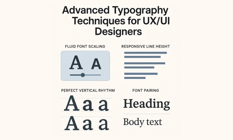
3Understanding Typography Hierarchy
Think of typography hierarchy like a GPS for the eyes. It guides users by establishing a visual roadmap. It’s all about mixing up font sizes, weights, and styles to shout out the big stuff and whisper the rest. A few key points include:
- Throwing the spotlight on headlines and titles
- Breaking up different chunks of text
- Making the main script easy on the peepers
Here’s a cheat sheet for a basic typography hierarchy:
| Element | Font Size (px) | Font Weight | Example |
|---|---|---|---|
| H1 | 32 | Bold | Large Heading |
| H2 | 24 | Semi-Bold | Subheading |
| H3 | 20 | Medium | Section Heading |
| Body | 16 | Regular | Body Text |
Want to dive into the nitty-gritty of typography hierarchy? Check out our article on typography basics for graphic designers.
4Utilizing Font Pairing Techniques
Like Batman and Robin, a good font duo can save the day. Pairing fonts is about making them work well together and bringing balance to your designs. Here’s how to keep them in sync:
- Contrast: Mix it up with different styles, such as a fancy serif with a sleek sans-serif, to add some visual oomph to your design.
- Complementarity: Ensure they match in style, weight, and size.
- Consistency: Maintain it throughout the entire process.
A top-tier pair might be:
| Font Combination | Style Use Case |
|---|---|
| Serif + Sans-Serif | Headlines + Body Text |
| Script + Sans-Serif | Decorative Elements + Navigation |
| Display + Serif | Titles + Subtitles |
Dive deeper into font matchmaking by reading our font selection for branding.
5Implementing White Space Effectively
🎓 Want to Master This Skill?
Join 10,000+ students at VFX India — Industry-standard training in Chennai with 100% placement.
🚀 Enroll Now💬 WhatsAppWhite space isn’t just space – it’s the unsung hero of design, giving your eyes room to breathe. It’s key for keeping layouts fresh and organized. Here’s the lowdown:
- It cuts down on clutter so that you can focus like a laser
- Pulls attention to the good stuff, keeps everything feeling easy and chill
Here’s how you can slip some white space in:
- Margins and Padding: Leave sufficient space around text blocks and other elements to ensure readability
- Line Height: Tune it just right so your text isn’t mashed together.
- Paragraph Spacing: Give paragraphs elbow room so thoughts flow like a babbling brook.
Check out this white-space action plan:
| Element | Margin (px) | Padding (px) | Line Height (em) |
|---|---|---|---|
| Body | 20 | 15 | 1.5 |
| Header | 30 | 20 | 1.6 |
| Footer | 25 | 20 | 1.4 |
Need more typography tips? Peek at our Typography Inspiration 2025 page for some killer ideas.
Following these typography know-how pointers will set your UX/UI designs on the right track, adding a splash of style and a breeze of usability. Grasping the hierarchy, brilliant font pairing, and effective use of italics will help elevate the user experience to the next level.
Advanced Typography Styling
6Customizing Typography Styles
Experimenting with typography is like giving your text a fabulous makeover. And who doesn’t love a good makeover, right? Swapping font weight, adjusting the size, and incorporating color can significantly alter the design’s feel and readability. When you get creative with these features, not only do you give your design a professional look, but you also help direct eyes to the key elements.
| Feature | Description |
|---|---|
| Font Weight | How chunky or slim your letters look |
| Font Size | Making the text shout or whisper |
| Font Color | Splashing colors for flair and focus |
| Letter Spacing | The breathing room between characters |
| Line Height | The gap between one line of text and another |
Want more cool tricks on tweaking typography? Check out our piece on typography tools in Photoshop and Illustrator.
7Incorporating Variable Fonts
Variable fonts? Oh, they’re a game changer. It’s like having a magic wand for fonts. You get a whole mix of styles packed into a single file. Designers can adjust the weight, width, slant, and optical size to ensure the text looks just right, regardless of the circumstances.
| Feature | Description |
|---|---|
| Weight | From whisper-thin to bold statements |
| Width | Widen or narrow down the character game |
| Slant | Lean your text left, right, or just right |
| Optical Size | Tweak for perfect looks in any size |
Using them smartly not only boosts performance but also keeps things looking sleek and cohesive. Dive deeper into this with our article on AI in font design.
8Creating Dynamic Text Effects
Spice up your UI/UX design with some dynamic text effects! Add animated text, gradients, or even 3D effects to give your design a lively kick. But keep it chill. Too much razzle-dazzle can be a buzzkill for your audience.
| Effect | Description |
|---|---|
| Animated Text | Movin’ and groovin’ for extra pop |
| Gradient Effects | Shifty color vibes for each letter |
| 3D Transformations | Bringin’ some depth like a pro |
When used effectively, dynamic effects elevate your designs to the next level—looking for inspiration? Get the lowdown on what’s trending in our typography inspiration for 2025.
Playing with typography styles, embracing variable fonts, and incorporating dynamic effects is how you break the mold on mundane design and serve up something fun and user-friendly. For even more tips, check out our guide on typography mistakes to avoid.
Responsive Typography Design
9Designing for Multiple Screen Sizes
Responsive typography is all about ensuring that your text is both easy to read and visually appealing, regardless of whether someone is using a small phone or a large desktop screen. By using flexible fonts and scalable units, such as REMs and EMs, you can adjust text sizes to match the device’s screen. This means the font will look just right no matter what gadget you’re on.
| Screen Size | Recommended Font Size (px) |
|---|---|
| Mobile (up to 480px) | 16 – 18 |
| Tablet (481px – 768px) | 18 – 20 |
| Desktop (769px – 1200px) | 20 – 24 |
| Large Screens (above 1200px) | 24 – 28 |
Media queries in CSS are the secret sauce for tweaking typography to fit the screen size of any device. This way, wherever you look, the text seems snappy and neat, creating a smooth reading ride.
10Adaptive Typography Solutions
Adaptive typography is about making text flexible and responsive to conditions such as screen size or user preferences. Fluid typography using CSS tools clamp() helps create text that fits right, no matter the gadget. This approach keeps your words clear and enticing across the board.
| Device Type | Font Unit | Example |
|---|---|---|
| Mobile | REM | font-size: 1rem |
| Tablet | VW (Viewport Width) | font-size: 2vw |
| Desktop | EM | font-size: 1.5em |
Variable fonts take things to the next level. They let you play with weight, width, angle, and more, so the reading experience is top-notch. Curious about variable fonts? Check out our customized typography styles.
11Ensuring Readability on Various Devices
Ensuring your text is visually appealing involves checking line height, letter spacing, and contrast. A good contrast between the text and background is essential for easy reading. The Web Content Accessibility Guidelines (WCAG) recommend a contrast ratio of 4.5:1 for standard text and 3:1 for larger text.
| Text Type | Minimum Contrast Ratio |
|---|---|
| Normal Text | 4.5:1 |
| Large Text | 3:1 |
Selecting the right line height (1.4 to 1.6 times the font size) and spacing between letters also enhances readability. Focus on a mobile-first approach so that typography scales up nicely for bigger screens. Check out more on what not to do in our typography mistakes to avoid.
Get the hang of responsive typography, and you’ll build user-friendly, eye-catching web pages. For advanced tips and tricks, dive into our write-up on typography tools in Photoshop and Illustrator.
Cutting-Edge Typography Trends
Typography in UI and UX design is constantly evolving, with wild trends setting the groundwork for new looks that wow users and effectively convey their message. Not only do trendy fonts create a captivating appearance, but they also ensure everything is easy to read.
12Embracing Experimental Typography
This isn’t your grandma’s type. Experimental typography flips the typical design script on its head. We’re talking funky font choices, quirky arrangements, and out-there typeface combos. You might see text twisted into funky shapes, piled into towers, or scattered all over for that “wow” factor.
This style often shines in branding projects or large campaigns where you want to make a strong impression. For some basics, check out our guide on typography tips for graphic maestros.
| Cool Techniques | What It Does |
|---|---|
| Wacky Text | Giving letters a facelift for a fresh twist |
| Layered Looks | Stacking letters and pictures for a pop-out vibe |
| Offbeat Alignment | Ditching the straight line for something more lively |
13Mixing Typography with Graphics
When letters meet pictures, sparks fly! Pairing fonts with visuals can spice up any UI/UX design. Text with pics, little icon buddies, or arty illustrations brings the screen to life.
Mastering this mix is all about balance – neither words nor visuals should hog the show. Clarity is king, especially in busy designs. This trick is a go-to for brands or cheeky ad work. For choosing the right type, peek our article on font picking for brand pros.
Imagine text swirled around a nifty graphic, tucked into playful drawings, or artfully dancing with patterns. It spices up stories and ups the fun factor in info delivery.
14Utilizing Animation in Typography
Add some zing to your text with animation. Watch type springs into action, with slides and fades grabbing eyeballs and uplifting the user vibe. Use it to highlight key ideas or add a playful twist.
Remember, though, less is more. Don’t go overboard with the bells and whistles—a little finesse goes a long way. For future glimpses of font fun, check our piece on typography trends in 2025.
| Animation Flavor | What’s It Do? |
|---|---|
| Fade In/Out | Text sneaks in or out as if fading from sight |
| Slide | Letters glide in from the side, top, or peek-a-boo from below |
| Smooth Transitions | Gracefully easing from one look to another |
Trendy typography, mashed with graphics and animated text, revamps UI/UX into an energetic, standout screen story. Jumping on these trends isn’t just about being flashy; it’s about weaving stories that stick.
Tools and Resources for Advanced Typography
Diving into advanced typography for UI/UX? You’re gonna need the right gear. From snazzy software to buzzing online hangouts, designers can tap into numerous resources to refine their skills and stay up-to-date with the latest trends.
15Software for Advanced Typography Design
Creating jaw-dropping typography needs some pretty nifty software. Here’s a quick rundown of crowd-pleasers in the typography toolbox:
| Software | Cool Stuff It Does |
|---|---|
| Software A | Super flexible text effects, fonts that bend and twist |
| Software B | Build-your-own-font kit, ace kerning |
| Software C | Text animations that popup work on lots of gadgets |
These handy tools help designers create one-of-a-kind typography for their UX/UI projects. If you want the lowdown on using these magic wands, check out our guide on typography tricks in Photoshop and Illustrator.
16Online Typography Resources
The web is bursting with goodies for designers eager to soak up knowledge and creativity. Here are some must-visit spots for fonts, how-to guides, and the latest buzz in typography.
- Typography Inspiration 2025
- Best Free Fonts for Designers
- Font Selection for Branding
- Typography and Social Impact
Browsing these sites keeps designers ahead in the typography game and fuels fresh ideas for their upcoming masterpieces.
17Typography Communities and Forums to Explore
Jumping into typography communities and forums is like having a backstage pass to a treasure trove of tips and candid insights from fellow industry professionals. These places are perfect for shooting the breeze, showing off, or trading notes on the latest crazes.
| Community/Forum | What They’re All About |
|---|---|
| Community A | What’s hot in typography, design smackdowns |
| Community B | The nitty-gritty of font-making, elite tricks |
| Community C | UX/UI design puzzles, solutions galore |
Getting in the mix with these gangs allows designers to swap stories, pick up fresh skills, and view their work from new angles. Learning from peers and soaking up feedback can significantly enhance one’s skills in advanced typography for UI/UX design.
For more advice and tips on avoiding common typography mistakes, check out our article on Oops moments in typography.
FAQS – Frequently Asked Questions
Advanced typography for UI/UX involves using detailed font techniques, such as variable fonts, responsive scaling, and OpenType features, to improve readability, hierarchy, and user engagement in digital interfaces.
Advanced typography for UI UX enhances the overall user experience by making interfaces easier to read, aesthetically balanced, and more intuitive, especially across multiple devices and screen sizes.
You can apply advanced typography for UI UX by using fluid type scales, proper line spacing, font pairing, and accessibility-focused practices in tools like Figma, Adobe XD, or CSS-based responsive layouts.
Some of the best tools for advanced typography for UI UX include Figma, Adobe Fonts, Google Fonts, Typewolf, and variable font libraries that allow dynamic control over weight and width properties.
Yes, advanced typography for UI UX plays a crucial role in accessibility by ensuring clear contrast, legible font sizes, and scalable text layouts that adapt well to screen readers and user preferences.
Avoid using too many font styles, inconsistent type scales, poor contrast, and ignoring responsiveness. These issues can weaken the impact of advanced typography for UI/UX.
Advanced typography for UI UX helps guide user attention, creates visual hierarchy, and enhances interaction flow. leading to better engagement and task completion.
Yes, kinetic typography and subtle animations are part of advanced typography for UI UX, helping bring focus to key elements while adding visual dynamism to interfaces.
No, typography for UI UX is critical for both desktop and mobile interfaces. Responsive font sizing, line heights, and viewport-based scaling ensure readability on all devices.
Variable fonts enable multiple weights and styles in a single file, allowing for smoother transitions, faster load times, and flexible design. all essential for typography in UI/UX.
Using custom fonts in advanced typography for UI UX can create a strong brand identity, but they should be optimized for performance, readability, and cross-browser compatibility.
Start with tools like Figma and study resources on type hierarchy, grid systems, and scaling. Practice implementing advanced typography for UI UX in small interface components before scaling up.
White space is essential in advanced typography for UI/UX. It improves legibility, separates content sections, and creates a more breathable, user-friendly layout.
Absolutely. Advanced typography for UI UX considers contrast ratios, font sizing, readability, and screen-reader compatibility to ensure inclusive design for all users.
Apps like Airbnb, Medium, and Dropbox showcase advanced typography for UI UX through responsive type scales, clean hierarchies, and accessible font choices that enhance usability.
📑 Table of Contents
- 1. Importance of Typography in UI/UX Design
- 2. Enhancing User Experience with Advanced Typography
- 3. Understanding Typography Hierarchy
- 4. Utilizing Font Pairing Techniques
- 5. Implementing White Space Effectively
- 6. Customizing Typography Styles
- 7. Incorporating Variable Fonts
- 8. Creating Dynamic Text Effects
- 9. Designing for Multiple Screen Sizes
- 10. Adaptive Typography Solutions
- 11. Ensuring Readability on Various Devices
- 12. Embracing Experimental Typography
- 13. Mixing Typography with Graphics
- 14. Utilizing Animation in Typography
- 15. Software for Advanced Typography Design
- 16. Online Typography Resources
- 17. Typography Communities and Forums to Explore
Master VFX, Design & AI in Chennai
Industry-standard training with 100% job placement. Start your creative career today!
🚀 Enroll Now💬 WhatsApp Us📂 Categories
Graphic Design (49)VFX (21)Action CGI (11)Visual Effects (10)Live Action (9)Typography (9)chroma key (6)Green Screen Keying (6)Stereoscopic 3D (5)Digital Marketing (5)Visual Effects (5)SEO (5)Camera Tracking (4)3D Movie (3)AI Graphic Design (2)app Development (2)UI UX (2)Match moving (1)Web Development (1)Film Editing (1)🎯 Related Courses
📚Graphic Design Course in Chennai📚VFX Course in Chennai📚Video Editing Course in Chennai📰 Recent Posts