


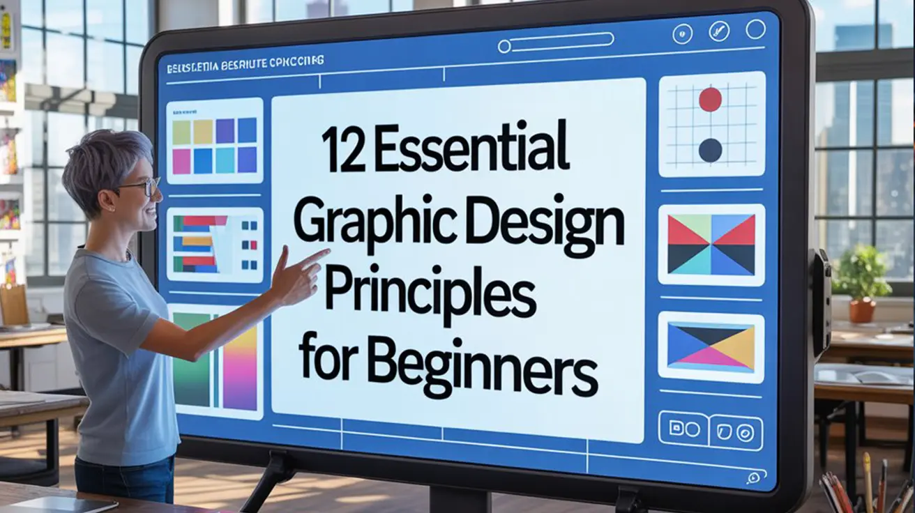
Graphic design isn’t just about making things look good it’s about communicating ideas clearly and effectively. Whether you’re designing a poster, a logo, a social media post, or a website, the success of your work often comes down to how well you apply the core graphic design concepts. These basic principles of graphic design form the foundation of every effective visual layout. By mastering these essential design principles, beginners can elevate their work from amateur to professional.
In this guide, we’ll walk you through 12 key graphic design principles including balance, contrast, alignment, and hierarchy. Whether you’re just starting out or revisiting the visual Design rules that guide top creatives, this breakdown is your go-to reference for building strong, impactful designs. If you’re looking to understand the design principles for beginners, this is the perfect place to start.
Graphic Design Principles
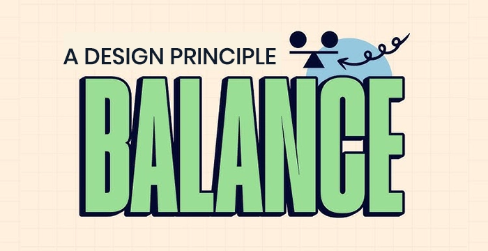
1. Balance
Balance is the distribution of visual weight within a composition. It ensures that no one part of the design overpowers another, creating a sense of stability and harmony.
Types of Balance:
Symmetrical Balance: Both sides mirror each other, conveying formality and elegance. It is common in traditional and corporate design layouts.
Asymmetrical Balance: Visual interest is created by offsetting elements of different size, color, or shape. It adds energy and a modern feel.
Radial Balance: Elements radiate from a central point, leading the eye naturally outward in a circular flow. Used often in logos or artistic compositions.
Why It Matters :
Without balance, a design feels awkward or unstable. Good balance guides the viewer’s eyes naturally and makes content easier to engage with.
💡 Pro Tip :
Use the rule of thirds or grid systems to maintain balance across elements.
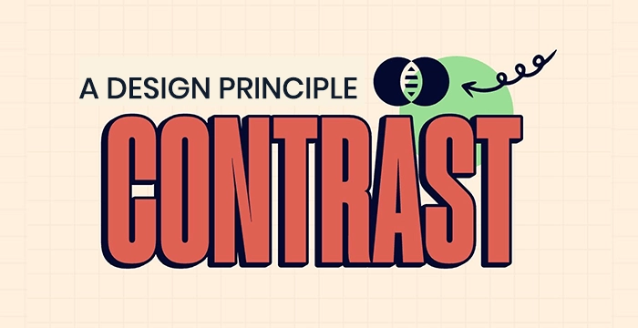
2. Contrast
Contrast helps differentiate design elements, guiding the viewer’s focus and improving readability.
Ways to Achieve Contrast:
- Color: Light vs. dark.
- Size: Large headlines, small subtext.
- Shape: Angular vs. rounded elements.
- Font: Serif paired with sans-serif.
Why It Matters :
Contrast helps the viewer quickly understand which elements are most important. It enhances readability, visual interest, and clarity.
💡 Pro Tip :
Ensure that contrast is not just aesthetic, but functional. Poor contrast can harm accessibility.
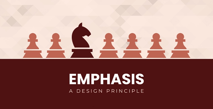
3. Emphasis
Emphasis ensures that the most important element stands out. This is often the call-to-action or main message.
Ways to Achieve Contrast:
Bold typography
Bright color against neutral background
Isolated positioning
Visual cues like arrows or highlights
Example: A “Buy Now” button in red on a minimalist white page immediately draws attention.
Why It Matters :
Emphasis directs users to take action, read a message, or focus on something critical. Without it, your design may feel flat or unfocused.
💡 Pro Tip :
Limit emphasis to one or two focal points to maintain clarity.
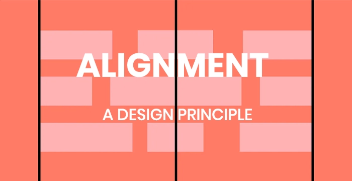
4. Alignment
Alignment refers to the way text and graphics are placed in relation to each other.
Types of Alignment :
- Left, Right, or Centered
- Edge or Grid-Based
- Visual Alignment with Other Elements
Why It Matters :
Proper alignment creates order, professionalism, and visual connections between elements. Misaligned text or images make a design look sloppy and confusing.
💡 Pro Tip :
Use invisible gridlines to maintain consistent spacing between text and visuals.
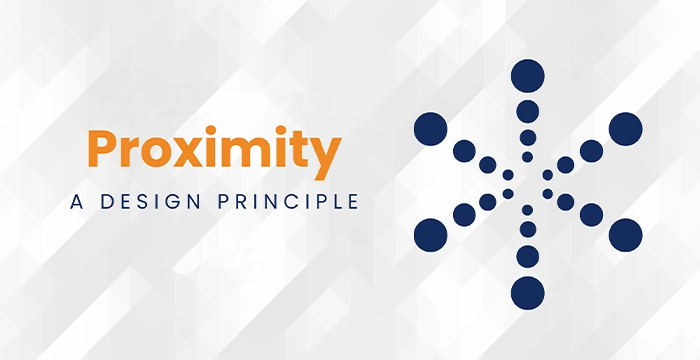
5. Proximity
Proximity relates to how close or far elements are placed in relation to one another. It communicates relationships.
How to Use It :
- Group a headline with a subheading or paragraph.
- Keep navigation items close to each other.
- Use spacing to show relationships or categories.
Example :
In a website menu, placing “Home,” “About,” and “Contact” close together indicates they’re part of the same menu group.
Why It Matters :
It reduces clutter, improves scanning, and helps users process information more easily.
💡 Pro Tip :
White space between unrelated groups helps improve scannability.
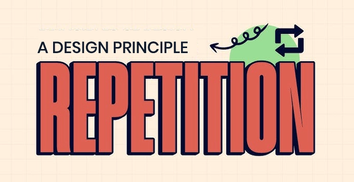
6. Repetition
Repetition is the consistent use of visual elements such as colors, fonts, or icons.
Where to Use It:
- Repeating branding elements like logo placement, color palette, or font across different pages.
- Using similar graphic shapes for section dividers.
Why It Matters :
Repetition strengthens unity and brand recognition. It gives users a sense of visual predictability, which is comforting and effective.
💡 Pro Tip :
Repetition should feel intentional. Overdoing it can cause monotony.
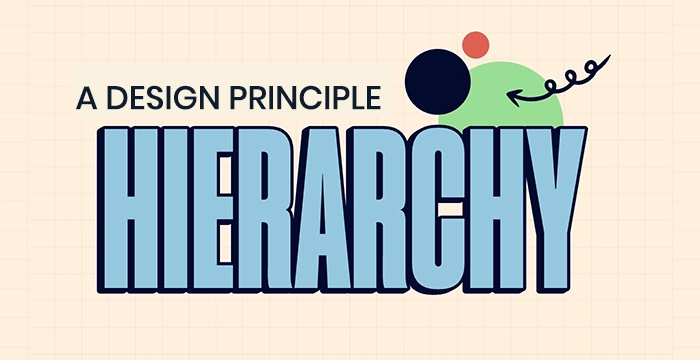
7. Hierarchy
Hierarchy guides the viewer through a design in order of importance.
How to Create Hierarchy:
- Size: Bigger elements are seen first.
- Color and Weight: Bold or colorful items stand out.
- Position: Items higher or central in layout get more attention.
- Typography: Using different font sizes and weights for headings and body text.
Example :
A landing page might start with a large headline, followed by a medium-sized subheading, and finally smaller body text.
Why It Matters :
Good hierarchy ensures viewers get the key message before secondary details. It’s essential for communication and usability.
💡 Pro Tip :
Establish a visual rhythm from the most to least important elements.
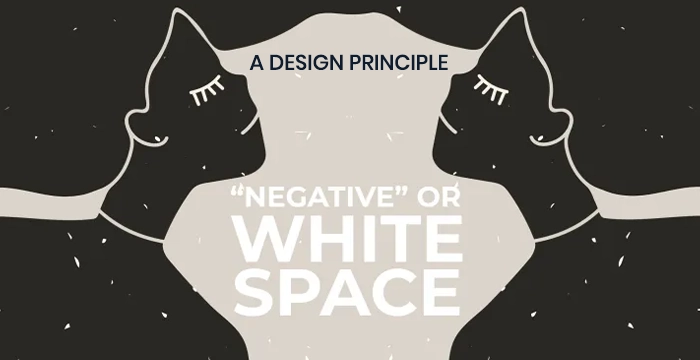
8. White Space (Negative Space)
White space refers to the empty areas between design elements. It gives content room to breathe.
Types:
- Active White Space: Intentionally used to structure content and improve readability.
- Passive White Space: Naturally occurring margins and paddings.
Why It Matters :
It improves readability, creates focus, and brings elegance and simplicity to the design. Overcrowded designs feel chaotic, while smart white space gives breathing room.
💡 Pro Tip :
Use white space strategically to draw attention and improve clarity.
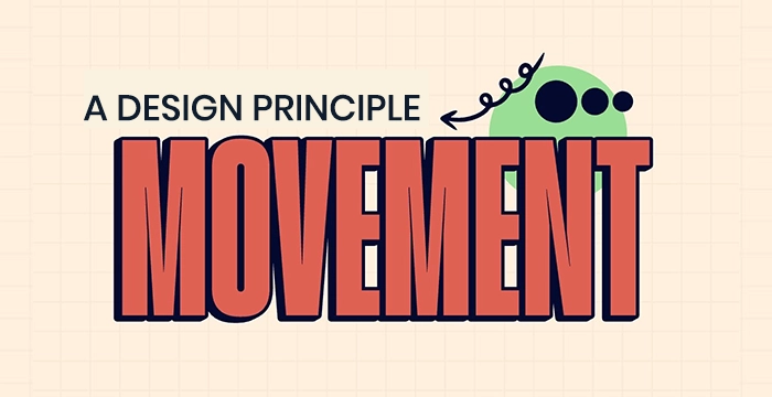
9. Movement
Movement creates a visual flow, leading the viewer’s eye through the design in a deliberate direction.
How to Create Movement:
- Using lines, curves, or arrows.
- Arranging elements from top to bottom or left to right.
- Strategic use of animation in digital design.
Example:
A poster with a large title at the top, followed by an image, and then smaller details at the bottom naturally guides the eye downward.
Why It Matters :
Movement ensures users absorb the information in the order you intend, increasing engagement and comprehension.
💡 Pro Tip :
Use motion graphics sparingly to enhance—not overwhelm—the message.
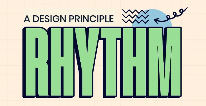
10. Rhythm
Rhythm is the repetition and variation of elements to create interest and consistency.
Types of Rhythm:
- Regular Rhythm: Predictable and consistent repetition (like stripes).
- Flowing Rhythm: Curved, natural repetition (like waves).
- Progressive Rhythm: Gradual change in a series (like increasing sizes).
Why It Matters :
Rhythm adds a sense of motion and tempo, making designs feel alive and engaging rather than static or random.
💡 Pro Tip :
Combine rhythm with contrast for designs that feel both orderly and engaging.
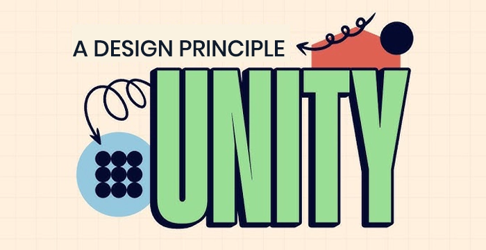
11. Unity
Unity ensures all parts of the design feel like they belong together. It supports cohesiveness.
Unity Methods:
- Use a consistent color palette and typography.
- Apply alignment and spacing consistently.
- Ensure visual and thematic harmony.
Why It Matters :
Unity brings order and purpose to a design. Without it, even strong individual elements can feel disjointed or messy.
💡 Pro Tip :
Design with the end experience in mind—unity helps create a seamless interaction.
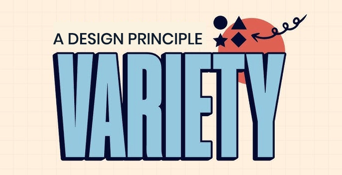
12. Variety
Variety introduces differences in elements to add interest and break monotony.
How to Use Variety:
- Mix colors, shapes, or textures—but with balance.
- Vary font weights, sizes, or styles for emphasis.
- Break visual repetition intentionally to highlight something new.
Why It Matters :
While repetition builds consistency, variety keeps things exciting and attention-grabbing. The trick is balancing both.
💡 Pro Tip :
Always balance variety with unity for a coherent but captivating layout.
 Final Conclusion : Essential Design Principles
These 12 Graphic Design Principles are the backbone of every great design. Whether you’re just starting out or refining your craft, understanding these essential concepts gives you the power to create visuals that are not only beautiful but also effective and strategic.
For beginners, learning the basic principles of graphic design like alignment, contrast, balance, and hierarchy can instantly elevate the quality of your work. These fundamentals make your layouts clearer, more intentional, and visually appealing.
Essential Design Principles Guidelines
They’re not just guidelines they’re the visual design rules professionals rely on to create high-impact content across print, digital, and motion design platforms.
If you’re serious about growing as a designer, focus on these design principles for beginners and experienced creatives alike. Mastering them will unlock your full creative potential and help you stand out in today’s competitive design industry.
🎓 Want to Be Interview-Ready and Industry-Ready?
You’ll gain hands-on training in:
✅ Adobe Photoshop, Illustrator & Figma
✅ Real-world design projects to showcase your expertise
✅ Mock interview prep and career mentoring
✅ Next-gen tools like Midjourney, Adobe Firefly, and Canva Motion.
Join our

or
build more than just skills—you’ll build confidence and a real portfolio that gets noticed.
Turn your creativity into a career that’s future-proof.
FAQ
The core graphic design principles for beginners include balance, contrast, alignment, repetition, proximity, hierarchy, and white space. These are the building blocks of all great design.
Design principles create visual harmony, ensure readability, and help communicate messages effectively. Following the fundamentals of graphic design leads to professional-looking results, even for beginners.
Visual hierarchy refers to arranging elements by importance. It helps guide the viewer's eye and makes the message easier to understand by using size, color, and placement.
Balance ensures visual stability. It can be symmetrical (equal on both sides) or asymmetrical (balanced through contrast or movement). It’s a key part of basic design rules.
Contrast creates emphasis and clarity. It’s used by varying colors, sizes, shapes, or fonts to make important elements stand out.
White space (or negative space) is the empty space between elements. It improves readability, reduces clutter, and adds elegance to a design.
Alignment creates order and structure, while proximity groups related elements together. Both make designs more readable and user-friendly.
No. But understanding each principle allows you to use them strategically. The best designs often balance 2–3 principles rather than applying all equally.
Yes. Whether you're designing a website, poster, logo, or social media post, these graphic design principles apply universally.
Tools like Canva, Adobe Express, Figma, and Photoshop allow beginners to experiment with layout, alignment, and contrast while learning real-world design skills.
Look at websites like Behance, Dribbble, Pinterest, and your favorite brand ads. These are full of visual examples of design principles in graphic design.
While design trends evolve, the core principles of graphic design have remained consistent. Mastering them ensures your work is timeless and adaptable.
Yes. Many successful designers are self-taught through mastering design principles, consistent practice, and building strong portfolios.
Ask yourself:
Is everything aligned?
Can the viewer find the most important element quickly?
Is there enough space and clarity?
Do the colors and contrast make sense?
Yes. VFX India and platforms like Coursera, Skillshare, and Domestika offer structured beginner-friendly courses focused on design fundamentals.
