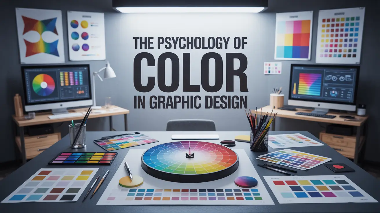
Why Color Is More Than Just Visual
Color is more than just visual appeal it’s a powerful communication tool. The psychology of color in graphic design plays a vital role in shaping how audiences perceive messages, brands, and emotions. Whether you’re designing a logo, website, or ad campaign, understanding the color theory in design helps you create more impactful visuals.
From red’s urgency to blue’s calm, each hue triggers a unique emotional response. That’s why leading brands carefully choose palettes that align with their identity and audience behavior. If you’re wondering how color affects branding, it’s all about creating a lasting, emotional connection through visual language.
Why Color Psychology Matters in Graphic Design
Research shows that up to 90% of initial impressions about a product or brand are formed based on color alone. It’s one of the first things people notice and one of the last things they forget.
The right color palette can:
Capture immediate attention
Build trust and emotional connection
Reinforce brand recognition
Influence decisions, from clicks to purchases
In short: color is communication. It’s how your brand speaks visually, even before a single word is read.
What Different Colors Mean in Design
Each color evokes specific emotions and associations. Here’s a breakdown of what popular colors typically convey in the context of design and branding
Red – Energy, Passion, Urgency
Red stimulates excitement, passion, and even hunger. It creates a sense of urgency and is ideal for call-to-actions and attention-grabbing designs.
Popular Brands: Coca-Cola, Netflix, YouTube
Best For: Sales promotions, food brands, entertainment, urgency-based campaigns
Orange – Playfulness, Creativity, Confidence
Orange radiates enthusiasm and creativity. It feels energetic and encourages engagement, making it a favorite for youth-oriented and dynamic brands.
Popular Brands: Fanta, Firefox, SoundCloud
Best For: Sports, education, youth-focused brands, action prompts
Yellow – Optimism, Warmth, Clarity
Yellow brings joy and clarity, but must be used wisely—it can easily become overpowering. In the right context, it creates a cheerful, approachable vibe.
Popular Brands: McDonald’s, Snapchat, IKEA
Best For: Startups, innovation, lifestyle brands
Green – Growth, Health, Tranquility
Green is calming, earthy, and stable. It’s strongly associated with wellness, sustainability, and finance.
Popular Brands: Whole Foods, Spotify, Animal Planet
Best For: Health and wellness, eco-brands, financial services
Blue – Trust, Intelligence, Calm
Blue is one of the most universally favored colors. It promotes a sense of reliability and intelligence—perfect for professional or tech-forward brands.
Popular Brands: Facebook, LinkedIn, IBM, PayPal
Best For: Tech, healthcare, finance, corporate branding
Purple – Luxury, Creativity, Wisdom
Blending the calm of blue with the energy of red, purple conveys imagination and sophistication.
Popular Brands: Cadbury, Twitch, Hallmark
Best For: Beauty, luxury, art, spirituality
Black – Sophistication, Elegance, Power
Black denotes class, mystery, and control. Used well, it adds elegance and depth.
Popular Brands: Chanel, Nike, Apple (in combination)
Best For: High-end fashion, luxury tech, premium services
White – Simplicity, Cleanliness, Freshness
White conveys purity and openness. It’s especially powerful in minimalist and health-focused designs.
Best For: Medical brands, modern websites, lifestyle and wellness products
Gray – Neutrality, Balance, Professionalism
Gray is subtle and timeless. It supports other colors well while standing firm in professional contexts.
Popular Brands: Mercedes-Benz, Apple
Best For: B2B, tech, formal or corporate communication
Cultural Considerations in Color Psychology
Color isn’t universal it carries different meanings across cultures. Designers must be aware of these nuances, especially in global branding.
| Color | Western Interpretation | Asian Interpretation |
|---|---|---|
| Red | Passion, Danger, Energy | Luck, Celebration, Prosperity |
| White | Purity, Simplicity | Mourning, Death |
| Yellow | Cheerful, Attention-grabbing | Royalty, Sacredness |
Tip: Always research your audience’s cultural background before finalizing a color palette for international campaigns.
How to Choose the Right Color Palette
Choosing colors should be intentional, not random. Here’s how to craft a palette that’s both beautiful and strategic
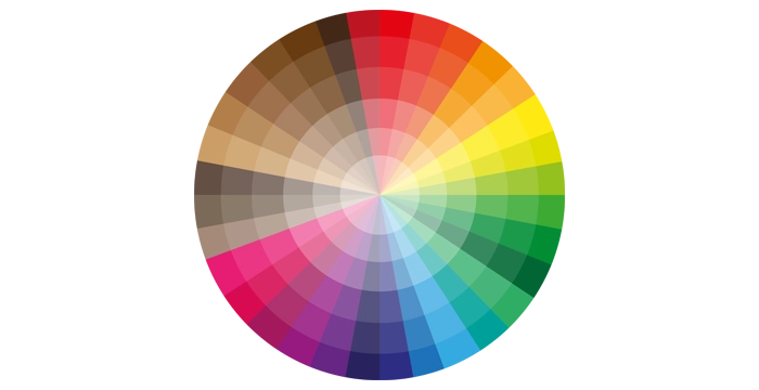
1. Define Your Brand Personality
Is your brand playful or professional? Calm or bold? Choose core colors that align with your tone and message.
2. Understand Your Audience
Demographics like age, gender, and location impact color preferences:
Teens often favor bold, saturated colors
Women typically prefer soft pastels and purples
Men gravitate toward blues, blacks, and darker shades
3. Use the 60-30-10 Rule
This classic formula creates balance in design:
60% – Primary color (main background or base)
30% – Secondary color (used for contrast or emphasis)
10% – Accent color (used for buttons, highlights, CTAs)
4. Ensure Accessibility
Test your color palette with accessibility tools to ensure readability and usability for all users—including those with visual impairments or color blindness.
Conclusion:
Make Every Color Count
In today’s competitive design landscape, color isn’t just decoration it’s strategy. Mastering the psychology of color in graphic design empowers you to create designs that not only look good but feel right. By applying color theory in design, considering the emotional impact of color, and understanding how color affects branding, you can elevate your work to connect deeper with audiences. In short, great design starts with smart color choices—because color speaks louder than words.
Want to Master Color Psychology in Design?
Take your skills to the next level with our Online Graphic Design Course, where you’ll learn:
The science and emotion behind Color Theory
How to build Brand Color Palettes that convert
Real-world applications through tools like Photoshop, Illustrator, Canva Pro, and Figma
Practical projects focused on branding, UI design, and marketing campaigns
FAQ
The psychology of color in graphic design explores how different colors influence perception, emotion, and decision-making. Colors evoke feelings—red can signal excitement or danger, while green suggests growth or calm.
Color theory in design helps designers understand how colors interact, complement each other, and affect composition. It guides decisions on contrast, harmony, and readability—key to creating effective visuals.
Color deeply influences brand identity. The right palette can increase brand recognition by 80%. Knowing how color affects branding lets you craft visuals that resonate emotionally and communicate your brand values instantly.
The emotional impact of color in design refers to how colors evoke feelings—yellow for optimism, black for sophistication, purple for creativity. Designers use this strategically to enhance user engagement and emotional appeal.
In color and visual communication, color guides the viewer’s eye, sets the tone, and enhances comprehension. It creates mood, focus, and visual hierarchy, especially in advertising, web design, and branding materials.
Absolutely. Poor color choices can confuse viewers or send the wrong message. That’s why a solid grasp of graphic design color psychology is crucial to ensure your visuals connect with the intended audience.
Different industries strategically use color to influence perception. Tech brands often use blue for trust, food brands use red and yellow to stimulate appetite, and luxury brands lean into black and gold for sophistication. This shows how color affects branding in industry-specific ways.
Warm colors like red, orange, and yellow evoke energy, urgency, and warmth. Cool colors such as blue, green, and purple convey calm, trust, and professionalism. Understanding this aspect of color theory in design helps in setting the right mood and emotional tone.
Cultural differences can change the meaning of colors. For example, white symbolizes purity in Western cultures but mourning in some Eastern cultures. For global brands, understanding the psychology of color in graphic design within cultural contexts is essential.
A/B testing, user feedback, and heatmaps can help gauge the emotional impact of color in design. Even subtle changes in shade can affect user behavior, making real-world testing vital to refining your color choices.
Accessibility is crucial. Colorblind users may not perceive certain colors the same way. Designers should consider contrast ratios and use patterns or labels in addition to color to improve color and visual communication for all audiences.
Yes! Tools like Adobe Color, Coolors, and Color Hunt help you apply color theory in design by generating harmonious palettes. These tools ensure your designs are both visually appealing and emotionally effective.
🎓 Need Help Creating a Portfolio?
Join our
or
build more than just skills—you’ll build confidence and a real portfolio that gets noticed.
- Learn Adobe Photoshop, Illustrator, InDesign & Figma
- Work on real-world design briefs
- Get one-on-one portfolio feedback
- Build a client-ready digital portfolio
- Learn how to present and pitch your work confidently


