


Understanding how a rule of thirds grid can elevate your designs is fundamental if you want to capture viewers’ attention and guide their focus. By positioning key elements where the human eye naturally falls, you can create a visual conversation that feels both balanced and dynamic. When you use this approach, you allow your audience ample room to breathe and explore your work.
Below is how you can harness this guideline to enhance your layouts, whether you are creating a website interface, laying out a print advertisement, or snapping a photo with your camera. Let’s explore how the rule of thirds fosters creative possibilities through a few practical steps.
Understand the rule of thirds.
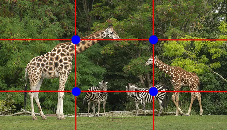
At its core, the rule of thirds breaks down your composition into nine equal boxes by drawing two horizontal and two vertical lines. By aligning your main subject or focal point with these intersections, you naturally guide how people view your work. Studies indicate that viewers are drawn to these intersection points instead of the center of the frame (Digital Photography School). For an in-depth exploration of photographic applications, you can look into the rule of thirds photography.
This technique also helps maintain balanced negative space, so your overall layout never feels cramped. If you position your subject to the left-third or right-third, the other two-thirds of the layout remain open to highlight additional content or to emphasize breathing room (Adobe). This balance leads to more engaging compositions, preventing designs from appearing overly “flat” or static.
Create your grid
An effective grid is relatively simple to make and can keep you on track when placing text, images, or other elements.
Mark your dimensions
First, identify the size of your canvas. Whether you are working with a photograph or a digital design, note the width and height. Find the one-third increments in each dimension. If you are designing a web page 1200 pixels wide, place vertical markers at roughly 400 pixels and 800 pixels. Do the same horizontally, adding lines based on the one-third increments of the page height.
Draw the lines
Using your design software, create two vertical lines and two horizontal lines for a total of nine equal zones. The upper-left, upper-right, lower-left, and lower-right intersections are where the viewer’s eye naturally lingers. By placing crucial elements. Like a main headline or a compelling graphic. At or near these hotspots, you can more effectively communicate your core message.
If you’re interested in how this approach translates across various design fields, check out the rule of thirds in graphic design. Similarly, you can see how other designers apply this concept by looking at the rule of thirds examples.
Position elements effectively
Once your grid is in place, consider all your visual elements concerning the gridlines. A strong layout typically sees the focal element (text, subject, or image) near one of the four key intersection points. This setup allows you to establish a visual conversation between your subject and the rest of the composition.
- Place your main subject (e.g., product photo, character image) near an intersection.
- Reserve one of the other three intersection points for secondary text or a key graphic.
- Leave the remaining areas for negative space or supporting visuals.
By doing so, you cater to the ways people typically scan a design. This asymmetry flows naturally, avoiding that rigid, overly centered look.
Expand to multiple media.
The rule of thirds grid is not just for photographs. It’s also applied in web and app interfaces, promotional materials, and even architectural designs. You’ll often see websites that place primary navigation elements in one-third of the page, while the remaining two-thirds host key imagery or text. Such strategic layouts support visual hierarchy in web design, guiding your audience seamlessly through content.
In photography, aligning horizons or prominent vertical lines with your grid lines can create dramatic yet balanced shots (PetaPixel). Meanwhile, in a print advertisement or a product label, emphasizing the brand’s name or logo at intersection points can help it stand out. The goal across all media is to draw viewer attention to the essential components while also preserving a sense of harmony.
Break the guidelines carefully.
Although the rule of thirds yields consistently strong designs, treat it as a trusted guide, not an unbreakable rule. Sometimes, centering your subject can provide a powerful sense of symmetry, or aligning elements near the edge of the frame might push creative boundaries in intriguing ways (Digital Photography School). The key is to understand why you are breaking the rule. If it supports the design’s narrative, that choice can become a compelling statement.
Experiment with positioning your subject outside the typical intersections, or try eye-catching angles that deviate from your grid’s lines. By doing so, you remain open to surprises that enrich your artistic expression. Explore these choices as you become more comfortable with the rule of thirds, so that every deviation from the norm feels intentional and purposeful.
To truly master this approach, practice editing your photos or refining your layouts with the rule of thirds grid in mind. You might notice immediate improvements in how visitors engage with your content. And if you’d like more hands-on guidance, you can always explore further resources or subscribe to a design-focused newsletter to stay inspired.
Explore frequently asked questions.
Below are some common questions about using the rule of thirds grid in design and photography. Each one offers quick insights to help you refine your skill set.
FAQS – Frequently Asked Questions
Any size works, as long as you divide both width and height by three. The exact measurements are less important than maintaining equal divisions across your canvas.
It’s a powerful starting point. But you can also place elements along the grid lines without sitting exactly on an intersection. Use your design intuition for the final call.
Not at all. It’s equally handy for web layouts, app interfaces, graphic design, and even architectural plans. Any medium that involves a balanced visual structure can benefit.
The rule of thirds applies to both orientations. Whether your layout is portrait or landscape, the grid remains a reliable roadmap for placing focal points.
Yes, and you’re encouraged to do so. Techniques like leading lines or the golden ratio can complement the rule of thirds for even more captivating results.
Most tools, such as Photoshop or Canva, let you toggle a rule of thirds guide. Check the “View” or “Guides” menu for a built-in option, or add manual guides at one-third intervals.
Absolutely. Whether designing an Instagram photo or a Facebook ad, placing text and images near grid intersections can help your content pop.
In that case, consider centering the subject if it fits the theme. Alternatively, you can offset the main subject to create extra negative space. Both choices can be visually appealing if done intentionally.
Think about where you want your audience to look first. Each intersection carries a slightly different natural flow, so place the most crucial element where you want to draw the strongest attention.
Many designers use it to make better-organized interfaces. By positioning essential calls to action near intersection points, users are more likely to notice and interact with them, potentially boosting conversion rates.
The rule of thirds grid is a compositional framework that divides an image into nine equal sections using two horizontal and two vertical lines. By positioning key elements along these lines or at their intersections, designers and photographers can create visually balanced and engaging compositions that align with natural viewing patterns.
To use the rule of thirds grid in photography, enable the grid overlay in your camera settings. Then, place your subject or focal point at one of the four intersection points or along a gridline, rather than centering it, to produce a more dynamic and aesthetically pleasing image.
Yes, beginners can benefit from using the rule of thirds grid as it provides a structured guideline for organizing visual elements. This helps create balanced layouts, improves visual flow, and simplifies decision-making during the design process.
Most digital cameras and smartphones include a rule of thirds grid option within their settings menu, typically under "camera settings" or "grid lines." Activating this feature displays a live overlay, assisting with precise framing and alignment while capturing photos or videos.
The rule of thirds grid is widely applicable across various visual disciplines, including video production and graphic design. In video, it guides subject placement within a frame, while in design, it informs layout decisions, enhancing both structure and visual harmony.
The rule of thirds grid enhances visual storytelling by directing the viewer's attention to strategic points within a frame. This technique not only creates compositional balance but also establishes narrative emphasis, allowing for more emotionally resonant and impactful visuals.
While the rule of thirds grid serves as a foundational guideline, it is not an absolute rule. Creative deviation is often encouraged once compositional fundamentals are understood. Deliberate rule-breaking can lead to compelling visuals when supported by clear design intent.
Professionals utilize the rule of thirds grid during the planning and execution stages of visual projects, such as positioning key elements during photo shoots, aligning text and imagery in layouts, and framing scenes in video editing, all to achieve visual coherence and aesthetic balance.
Common errors include over-relying on the grid without considering context, ignoring visual weight distribution, or misaligning elements that unintentionally disrupt flow. Effective use of the rule of thirds grid requires thoughtful integration with other design principles.
Yes, the rule of thirds grid can significantly enhance the visual appeal of social media content by guiding the placement of subjects, text overlays, and graphic elements. This results in more engaging, scroll-stopping visuals that draw the viewer's eye naturally.