


Understand the basics
When it comes to creating striking layouts, the rule of thirds in graphic design can be a game-changer. This approach involves dividing your canvas into a grid of nine equal sections, using two horizontal and two vertical lines. By strategically placing key elements where these lines intersect, you encourage a visual conversation that flows from one point of interest to another. These areas are where the human eye naturally falls, allowing you to guide viewers smoothly through your composition.
In simpler terms, the concept involves dividing your design into thirds to create a more dynamic and balanced appearance. While it may seem like a subtle trick, many designers rely on it to make their work more engaging, whether they are creating a social media graphic, a website banner, or a poster. If you are new to composition techniques, this method can give you the confidence to organize your elements in a way that resonates with your audience.
Position your elements
The rule of thirds helps you position text, images, and other design components so they catch attention instantly. Instead of centering everything, consider aligning your subject along a third of your layout. For instance, if you are creating a flyer for an activewear brand, placing the headline on the left third and the main visual on the right third can generate a more dynamic feel.
- Decide which elements need the most focus, such as logos, headlines, or product images.
- Align them with one of the four intersection points created by the grid lines.
- Use the remaining space to guide the eye toward supporting details or calls to action.
By positioning key features off-center, you can create an intriguing visual hierarchy. This approach draws your viewer into the design, pulling them toward important details without overwhelming them.
Apply a grid approach.
Having a clear grid system is essential for designing with confidence. Most design software, from Adobe Illustrator to Canva, allows you to enable or create a grid to guide your composition. If you prefer a quick reference, take a look at a rule of thirds grid to see how these lines can be applied to almost any dimension.
Beyond software, you can also sketch the grid manually by dividing the layout into three equal parts horizontally and vertically. If you want real-time feedback when arranging images, consider exploring camera-like overlays, similar to the grid available on your phone’s camera. This tactic is highly beneficial when experimenting with rule of thirds photography, but it also transfers well to other aspects.
People’s eyes tend to gravitate toward intersection points rather than the center of a design or photograph. So, when you align essential elements along these lines, you increase the likelihood that viewers will engage with your message immediately.
Blend with visual hierarchy.
While the rule of thirds is essential, it becomes even more powerful when combined with broader design principles, such as visual hierarchy in web design. Start by identifying the key messages you want your audience to see first, second, or third. Then, place these messages along the grid lines in descending order of importance.
For instance, a hero image with a bold headline could occupy one intersection point, while a subheading or short description lines up with another. This ensures that each piece of text or graphic has its place in the visual conversation. The more you practice, the more you will notice how the viewer’s gaze flows from one third of the design to the next.
Know when to break rules.
Although the rule of thirds provides a reliable foundation for balanced layouts, it is not set in stone. Sometimes, you might have a symmetrical subject that looks better when centered, or you may want to use a unique layout that challenges traditional expectations. Trust your creativity and consider breaking the rule of thirds if it effectively strengthens your message or highlights an essential feature compellingly.
If you would like more examples of how this technique can be applied to various projects, take a look at some rule of thirds examples for inspiration. You will notice that designers often intentionally break the rule to achieve specific artistic or branding goals. The key is to understand the principle well enough so that when you do break it, you do so thoughtfully.
If you want to keep exploring new ways to organize your layouts, never hesitate to master different grids or experiment with unconventional placements. The most significant benefit of the rule of thirds is that it helps you communicate your message smoothly, but it is only one tool in your composition toolbox. By understanding when to use it and when to push past its boundaries, you can keep your designs both dynamic and memorable.
FAQS – Frequently Asked Questions
The basic principle is the same: you divide your space into nine equal sections. In photography, you typically use it to frame a subject in an interesting way, whereas in graphic design, it helps position text and visuals within a cohesive layout.
It is a great starting point for balanced compositions. Once you gain more experience, you can decide whether to use it for each project or combine it with other layout techniques.
You can draw two equally spaced horizontal lines and two vertical lines across your canvas. Some design tools provide a built-in grid option, so check your tool’s settings to see if that is available.
Absolutely. Aligning headings, subheadings, and important content along the grid lines can make your design clearer and more appealing. This approach often prevents the layout from looking cluttered.
Many designers place logos near an upper or lower third, so they are noticeable without overpowering the main message. Experiment with different positions to find what suits your brand best.
Yes. Social media graphics benefit greatly from compelling compositions. Using the grid can help draw viewers’ attention faster as they scroll through their feeds.
Try aligning a critical part of that element, like a focal point, along one of the third lines. Even partial alignment can create a sense of balance and visual intrigue.
You can break your text into sections and place each section near an intersection point. This keeps everything organized while encouraging the viewer to move logically through the information.
It refers to how your design elements “speak” to each other through placement, color, and hierarchy. The rule of thirds helps direct that conversation, guiding the viewer’s eye from one element to another.
Definitely. If a centered or symmetrical layout works better for your concept, feel free to break the rule. The goal is to enhance your design, not to force it into a grid that does not fit the project.
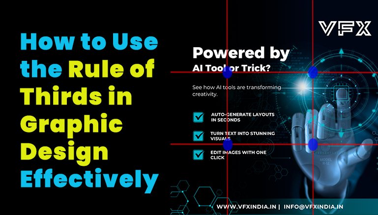
The Rule of Thirds in Graphic Design is a visual composition guideline that divides a design space into nine equal sections using two horizontal and two vertical lines. Key elements are placed at the intersections or along these lines to create balance and focus. This technique enhances visual harmony, guides the viewer's eye naturally, and improves the overall aesthetic appeal of the design. It's widely used in layouts, photography, and user interface design to create professional, engaging visuals
Beginners can easily apply the Rule of Thirds in graphic design by enabling grid overlays in tools like Adobe Photoshop, Illustrator, Canva, or Figma. Start by placing focal elements (text, images, icons) at the four intersections or along the vertical/horizontal thirds. Practice with simple layouts, like putting a headline in the top-left third and visuals on the right. This method helps create eye-catching and organized designs, even without advanced experience.
The Rule of Thirds is a flexible principle that works well across most types of content, from posters and brochures to websites and social media graphics. It's beneficial when you need to prioritize key information or draw attention to specific areas. However, its effectiveness can vary depending on the design's purpose and style. For symmetrical or minimalist layouts, other composition techniques may complement or even replace it.
A common mistake is applying the Rule of Thirds too rigidly, which can result in unnatural spacing or forced composition. Avoid overcrowding the focal points or ignoring white space. Misaligning elements slightly off the thirds grid can also create visual tension. Remember, the rule is a guide, not a strict formula. Combine it with other design principles like hierarchy, contrast, and proximity for the best results.
Yes, breaking the Rule of Thirds in graphic design can lead to innovative and memorable compositions. While the rule promotes balance, some designs benefit from central alignment or asymmetrical layouts that create surprise or drama. The key is intention—break the rule when it enhances the message or emotional impact of your design. Mastering the rule first helps you break it skillfully.