


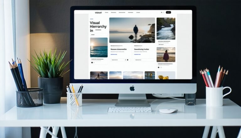
Recognize visual hierarchy
If you want to create an effective visual hierarchy in web design, you need a clear plan that guides your viewers’ eyes. One proven approach is to strategically arrange key elements so that important information naturally appears where a person’s gaze falls. By structuring your website layout in a way that showcases the most important content first, you give people a seamless journey from start to finish. A good visual hierarchy keeps users engaged, saves them time, and encourages them to explore further.
Visual hierarchy emphasizes the order in which design elements are perceived, typically determined by contrast, size, color, and placement. When you understand how people tend to scan images and text, you can prioritize essential components such as calls to action, headlines, or core imagery. This approach goes beyond aesthetics because it leverages how our eyes naturally move. It’s a powerful method for making your designs both compelling and easy to navigate.
Introduce the rule of thirds.
To build a dynamic and balanced layout, consider the rule of thirds. The core idea is to divide your page, photo, or any design into a grid of nine equal boxes, typically formed by two horizontal and two vertical lines. Placing key elements along these lines or near their intersections often results in more engaging compositions. As noted by Digital Photography School, these intersections—sometimes called power points—naturally draw attention, creating a “visual conversation” within your design.
While the rule of thirds is commonly discussed in photography, it’s equally powerful when shaping user experiences. By leaving open space in some sections and emphasizing focal elements in others, you create a balanced composition that helps users process information more smoothly. You might find it helpful to experiment with a rule of thirds grid directly in your design software to align text, images, and buttons.
Align elements for clarity.
A critical part of visual hierarchy is deciding how to position elements so your layout feels fluid and approachable. When you align headings, images, or special features with grid lines, you naturally allow the viewer’s eye to flow from one area to the next. This avoids cluttered layouts and helps you communicate your key messages effectively.
Consider several tactics to enhance clarity:
- Emphasize focal points: Place your most important text, such as headlines or calls to action, near the grid’s intersection points.
- Combine with size contrast: Make larger headlines or graphics occupy a third of your layout, while more petite or supporting text fills the remaining space.
- Use negative space: Give users visual breathing room around essential elements. That clean separation helps them focus on what truly matters without feeling overwhelmed.
If you’d like to explore how other designers apply these principles, visiting the rule of thirds in graphic design can deepen your understanding of practical techniques. You can also look at rule of thirds examples for different design interpretations, ranging from architecture to advertising.
Blend creative freedom with guidelines.s
Despite its proven benefits, the rule of thirds is not a rigid commandment. As Adobe suggests, you can break it on purpose to spark visual intrigue. In some compositions, placing a subject dead-center or using symmetrical elements can yield dramatic impact. It’s all about matching the method to your message.
- Balance vs asymmetry: Web designs with symmetrical layouts can feel stable and polished, while asymmetrical compositions often appear energetic and innovative.
- Deliberate misalignment: Consider experimenting by shifting headlines or photos slightly off-grid to see if it enhances the story you’re telling.
- Iterative testing: Tools like Photoshop, Illustrator, or Canva allow quick modifications and let you adjust your compositions according to user feedback.
Ultimately, it’s best to see the rule of thirds as a launching pad for your creativity. By mixing theoretical guidelines with your unique style, you maintain a sense of structure while leaving room for innovation and personal expression. If you want to see how photographers adapt this concept on the fly, have a look at the rule of thirds photography.
By combining the rule of thirds with a clear sense of priority in your layout, you create designs that feel intuitive and visually pleasing. Remember, mastering visual hierarchy in web design comes from a willingness to experiment, adapt guidelines to your unique style, and remain curious about what resonates most with your audience. It’s a step-by-step journey that strengthens your work every time you put it into practice.
FAQS – Frequently Asked Questions
Visual hierarchy is the arrangement or presentation of elements in order of importance. It matters because it guides users to what’s most crucial first, enhancing clarity and user experience.
It provides a simple grid system that helps you place focal points where viewers’ eyes naturally fall, resulting in layouts that feel balanced and inviting.
Not necessarily. It’s a guideline that works well in many situations, but you can break it intentionally if it results in a more impactful design.
Yes. Devices of all sizes benefit from an organized layout. The grid concept can be adjusted to different screen dimensions while preserving balanced compositions.
Popular programs like Photoshop, Illustrator, and Canva often include grid overlays. Activating these can make it easier to align text, images, and calls to action.
Absolutely. Positioning important text along intersections helps your headlines stand out and encourages users to read further.
Concepts like color contrast, negative space, and scale work hand-in-hand with the rule of thirds to reinforce visual hierarchy and clarity.
Visual hierarchy in web design refers to the arrangement of elements on a webpage to guide the viewer’s eye in order of importance. It helps users understand what to focus on first, improving clarity, usability, and conversion rates.
Visual hierarchy in web design is created through size, color, contrast, spacing, alignment, and typography. By using these elements intentionally, designers direct attention to key actions like headlines, buttons, or calls-to-action.
Common mistakes in visual hierarchy in web design include using too many focal points, inconsistent font sizes, poor color contrast, and cluttered layouts, making it hard for users to know where to look.
Typography plays a crucial role in visual hierarchy in web design by establishing levels of importance through font weight, size, and style. A bold headline naturally draws attention before smaller body text.
Absolutely. Visual hierarchy in web design enhances UX by reducing cognitive load, guiding users smoothly through content, and making interfaces more intuitive and enjoyable to navigate.
Colors impact visual hierarchy in web design by creating contrast and emphasis. Brighter or bolder colors tend to stand out, while muted tones help background elements recede, establishing a natural visual flow.
Design tools like Figma, Adobe XD, and Sketch offer grid systems, typography scales, and contrast checkers that assist in building a strong visual hierarchy in web design effectively.
Yes, visual hierarchy in web design is especially important for mobile users, where limited space demands clear organization. Prioritizing key content ensures better readability and faster decision-making on smaller screens.
You can test visual hierarchy in web design through user testing, A/B testing, or blur tests to see if users’ eyes are naturally drawn to the right elements without confusion or effort.
Great examples of visual hierarchy in web design include landing pages from Apple, Airbnb, and Dropbox. Each uses size, spacing, and contrast to lead the user’s journey effortlessly.